---
title: Introduction to Flexbox
related:
- title: CSS Spacing Classes
path: ../../style/spacing.md
- title: CSS Visibility
path: ../../style/visibility.md
- title: Grid Column
path: column.md
- title: Grid Gutter
path: gutter.md
---
Quasar provides lots of CSS classes to help you build your UI easily with the help of [Flexbox](https://css-tricks.com/snippets/css/a-guide-to-flexbox/). Think of it like operating with rows and columns with many options at hand.
Flexbox (upon which Quasar Flex CSS classes are based) module aims to provide a more efficient way to lay out, align and distribute space among items in a container, even when their size is unknown and/or dynamic (thus the word “flex”).
> [!NOTE]
> This page covers the basic theory of Quasar Flex CSS classes and prepares you for the in-depth pages on [Grid Row](row.md), [Grid Column](column.md) and [Grid Gutter](gutter.md).
## Key concept
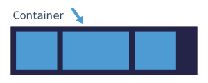
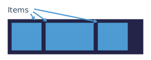
Quasar Flex CSS classes apply to either the Container (Parent) or the Container's items (Children).
## Managing Parent
### Setting Direction
One of the following CSS classes is mandatory for the parent in order for ones on the children (described in next sections) to have any effect.

| Class Name | Description |
| --- | --- |
| `row` | Flex row |
| `row inline` | Inline Flex row |
| `column` | Flex column |
| `column inline` | Inline Flex column |
| `row reverse` | Flex row with `flex-direction` set to `row-reverse` |
| `column reverse` | Flex column with `flex-direction` set to `column-reverse` |
```html
First column
Second column
Third column
```
### Wrapping by default
By default, all rows and columns wrap their content.
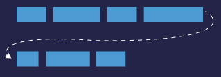
However if you explicitly do not want to wrap and by so doing you want to fit all content into one line, then add `no-wrap` CSS helper class.
Also, if you want to wrap in reverse order, then `reverse-wrap` is available.
| Class Name | Description |
| --- | --- |
| `wrap` | Wrap if necessary ("on" by default, no need to specify it) |
| `no-wrap` | Do NOT wrap even if necessary |
| `reverse-wrap` | Wrap backwards if necessary |
### Alignment
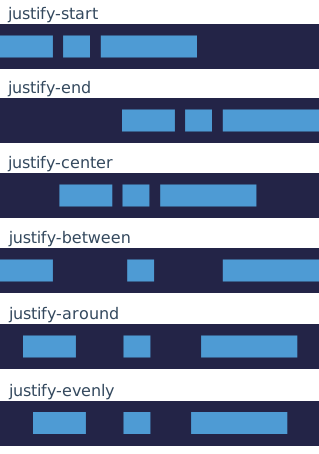
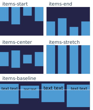
**For alignment along the main axis**, use classes below. It helps distribute left over free space when either all the flex items on a line are inflexible, or are flexible but have reached their maximum size. It also exerts some control over the alignment of items when they overflow the line.
**For alignment perpendicular to the main axis**, use classes below. This defines the default behavior for how flex items are laid out along the cross axis on the current line. Think of it as the horizontal-* version for the cross-axis (perpendicular to the main-axis).
> [!TIP]
> There is also the convenience `flex-center` CSS class which is equivalent to `items-center` + `justify-center`. Use it along with `flex`, `row` or `column`.
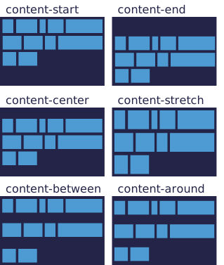
The next classes **align a flex container's lines** within when there is extra space in the cross-axis, similar to how horizontal-* aligns individual items within the main-axis.
## Managing Children
### Distribution of Size
Quasar uses a 12 point column system for distributing the size of row children. Here are some examples of the available CSS helper classes:
```html
two thirds
one sixth
auto size based on content and available space
fills remaining available space
```
In the example above, `col-8` fills two thirds (2/3) of the row width, because 8/12 = 2/3 = 66%, while `col-2` occupies one sixth (2/12 = 1/6 ~ 16.67%).
CSS helper class `col-auto` makes the cell fill only the space it needs to be rendered. `col`, on the other hand, tries to fill all space available while also shrinking if needed.
CSS helper class `col-grow` makes the cell fill at least the space it needs to be rendered, with the possibility to grow when more space is available.
CSS helper class `col-shrink` makes the cell fill at most the space it needs to be rendered, with the possibility to shrink when not enough space is available.
Another example with a visual representation below it:
```html
1
1
1
1
2
1
```
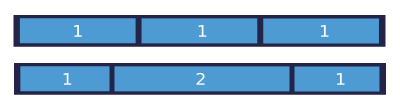
It is also possible to offset a cell. For example: `offset-4` offsets a third of space (4/12 = 1/3 = 33%).
### Wrapping
Wrapping is a key feature in understanding Flex CSS classes. You are not bound to use exactly 12 points per row. You can use less or even more.
This allows you, among other things, to dynamically stack rows vertically on smaller screens while displaying them on a single line on bigger screens. Read the "Responsive Design" section.
```html
...
...
...
...
```
> [!NOTE]
> that rows are wrappable by default. Should you wish to disable this, use the `no-wrap` CSS helper class.
### Self Alignment
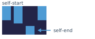
**An item can override the aligned specified on parent**. This allows alignment to be overridden for individual flex items. Please see the "Alignment" explanation from "Managing Parent" to understand the available values (`self-start`, `self-center`, `self-baseline`, `self-end`, `self-stretch`).
### Order
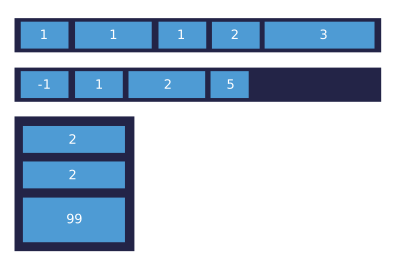
**You can set the order** of child elements by using `order-first` and `order-last` CSS helper classes.
By default, flex items are laid out in source order. However, the order property controls the order in which they appear in the flex container. If you need more granularity, use `order` CSS property and assign the desired value.
```html
Second column
Third column
First column
```
Here is how the CSS `order` property works:
## Responsive Design
Quasar Flex CSS classes can be applied based on the width of the screen, to help you in making a responsive UI. The 12 points grid is inspired by Bootstrap's, so there are a lot of similarities.
Breakpoint specifiers use a mobile-first approach, where the larger breakpoint definitions will override the smaller ones.
What we've learned so far is that, for example, we can size the columns regardless of window width. If we are to create a responsive UI, we need to dynamically change the sizing while taking window width into account. First, let's learn about some tokens that you can inject in middle of `col-*`, `offset-*` and `col-auto` helper classes (look at table below for tokens).
| Token | Min window width | Description / When it applies if not overridden by another larger breakpoint |
| --- | --- | --- |
| `xs` | 0px | All window sizes (same as no breakpoint specifier) |
| `sm` | 600px | Larger than extra small sized window |
| `md` | 1024px | Larger than small window |
| `lg` | 1440px | Larger than medium-sized sized window |
| `xl` | 1920px | Larger than large sized window |
Example: `col-md-7`, `offset-lg-3`, `col-xs-auto`.
A full example: let's say we have a row with three children. In extra small windows, we need to stack the children vertically, In small windows we need to display them side by side (each having equal width), and starting with medium windows we should display them all on same line:
```html
col
col
col
```
Notice in the above example that we used `col-xs-12` (12/12 = 100% of row, so each child will take full width of the container making all children stack vertically, since rows wrap content by default), `col-sm-6` (6/12 = 50% of row) and `col-md-4` (4/12 = 33% of row).
Like previously mentioned, rows wrap content by default, so when 12 (or more) grid points are used for a row, content is wrapped to the next line. If we have two `
`s and we use `col-8` on both, they will also stack, since 8 + 8 = 16 and we can only display 12 points on a single line.
```html
col
col
```
Also check [Visibility](../../style/visibility.md#window-width-related) Style page to see thresholds on window width and these tokens (xs, sm, md, lg, xl) used on their own to hide or show DOM elements.
## Flex Addons
When enabled, it provides breakpoint aware versions for all flex (and display) related CSS classes.
With Quasar CLI, switch it on through `quasar.config file > framework > cssAddon: true`.
> [!WARNING]
> [!NOTE]
> that there will be a noticeable bump in CSS footprint when enabling it. So only do it if you really need it.
```
.flex--(block|inline)
.(row|column|flex)-(|-inline-)
.reverse-
.(wrap|no-wrap|reverse-wrap)-
.order--(first|last|none)
.justify--(start|end|center|between|around|evenly)
.items--(start|end|center|baseline|stretch)
.content--(start|end|center|between|around)
.self--(start|end|center|baseline|stretch)
.flex--center
.q-gutter-(|-x|-y)-(xs|sm|md|lg|xl)
.(col|offset)--(|0..12)
```
There are also responsive classes for spacing, both for padding and for margin:
```
.q-(p|m)(t|r|b|l|a|x|y)--(none|auto|xs|sm|md|lg|xl)
```
Examples: `row-md`, `items-lg-end`, `q-pa-xs q-pa-sm-sm q-px-md-lg q-py-md-md`
### Enabling outside of Quasar CLI
`cssAddon` is a Quasar CLI option, but the addon itself is a plain stylesheet, so the other flavours
can pull it in directly.
With `@quasar/vite-plugin` (or any bundler that handles Sass), import it once, next to wherever you
import the Quasar CSS. This is the exact same import that Quasar CLI generates for you:
```js
import 'quasar/src/css/flex-addon.sass'
```
With [UMD](../../start/umd.md), add the prebuilt stylesheet after the base one:
```html
```
Use `quasar.addon.rtl.prod.css` instead if you are serving an RTL language.
## Flex Playground
To see the Flex in action, you can use the Flex Playground to interactively learn more.
[Flex Playground](/layout/grid/flex-playground)